It this part I am going to dive into a short and crude UX design phase for the Activity Journal application.
This article is Part 2 in a 3-Part Series.
- Part 1 -Activity journal - a mobile application idea and a personal project kickoff
- Part 2 -Activity journal - designing UX
- Part 3 -Activity journal - progress update
Table of contents
- Purpose of this phase
- Constraints and assumptions
- Navigation flow
- Timeline
- Add activity flow
- Activity detail and edit
- Navigation
- Categories
- Remaining screens: Backup, Sync, About
- What’s next?
- Footnotes
Purpose of this phase
My dear reader shall be reminded: this is a training application. This application may be never released. I am working on it solely in order to train some skills and explore some technologies as I already explained in the first part of this series.
The purpose of this part is to explore some ideas about the application’s user interface and create some initial notion of the product I am going to build. This design phase is not supposed to be thorough and the resulting design won’t be final. I am going to practice iterative development1 and TDD and decisions will be made as the development progresses.
However, it’s good to have some starting point, some vision which would allow me to asses the size of the project and would help me to start development.
Constraints and assumptions
As this is not a regular project, but a training project and I am a single person with a limited amount of time, I am going to simplify things as much as I can. We can say, that we are going to design some kind of MVP2, which I can further improve in the future.
So I am going to:
- focus mainly on “basic features” of the application as listed in the previous article
- use the Material design as a design framework and build UI preferably from the material design components,
- attempt to avoid complex custom views that would require a vast amount of effort to create,
- use a pen and paper for hand-drawn diagrams and wireframes, so excuse my drawing3 and handwriting.
I recommend the dear reader to glance over features in the first article before we continue.
Navigation flow
This is just a simple draft of a navigation graph that crudely captures screens and navigation paths between them. This may even change before we reach the end of this article.
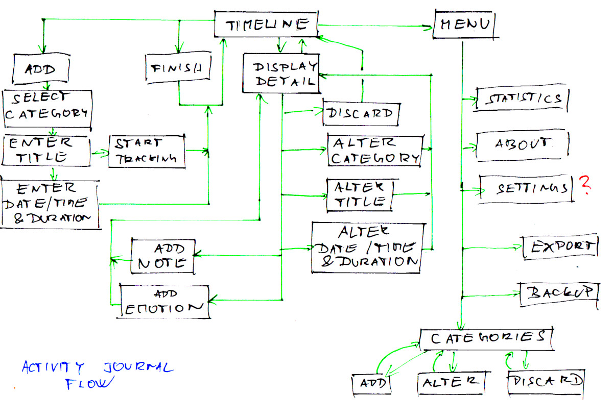
A user starts on the Timeline where undergoing and past activities are displayed. They can easily add new activity or display detail of existing one. They can also show some kind of navigation where they can access the rest of the application. You may notice that I automatically added a “settings” screen but later realized, that since backup and settings (both candidates for presence on the settings screen) might have dedicated screens for themselves, there won’t be anything left for the settings screen.
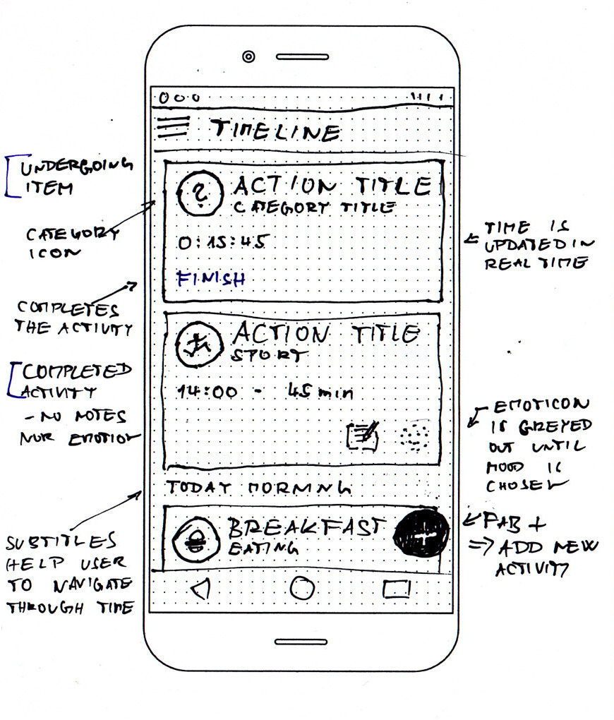
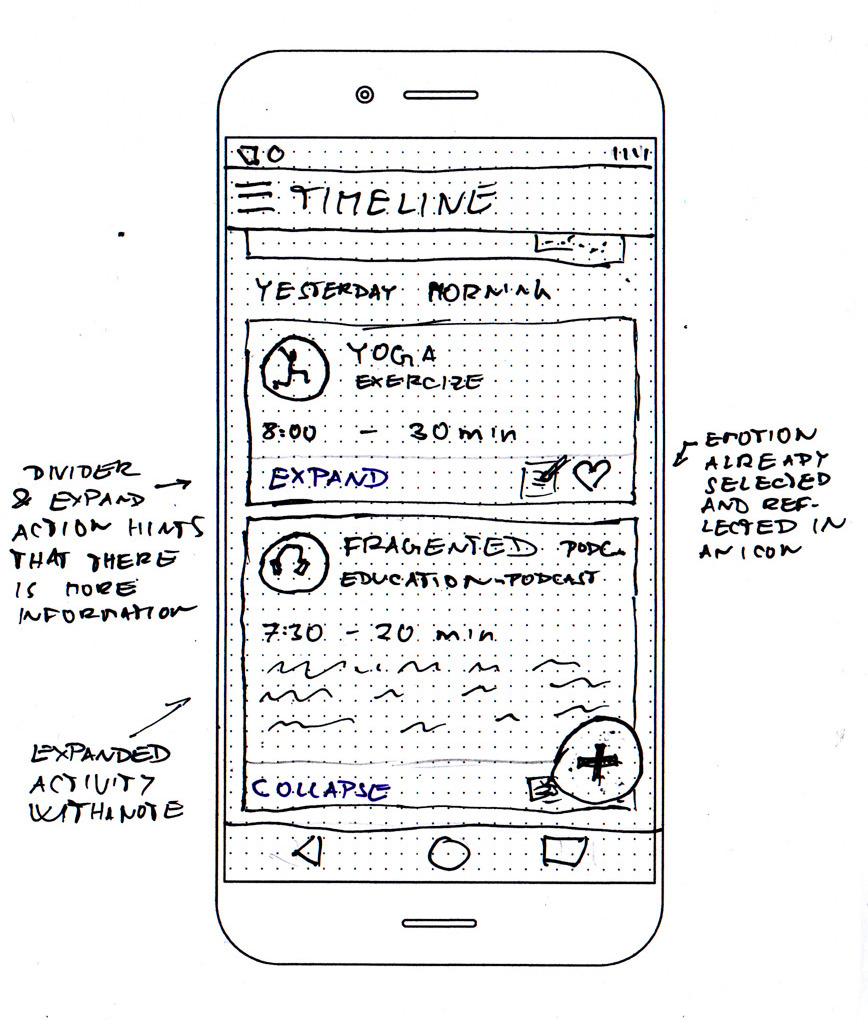
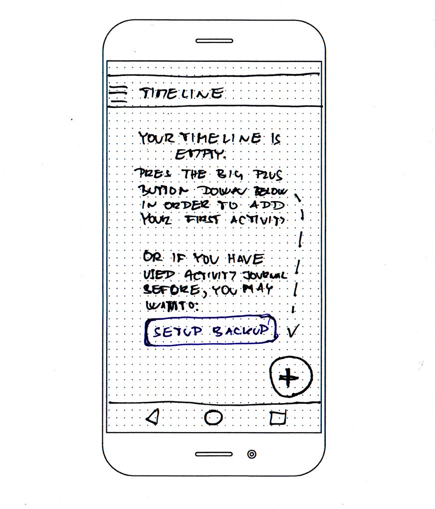
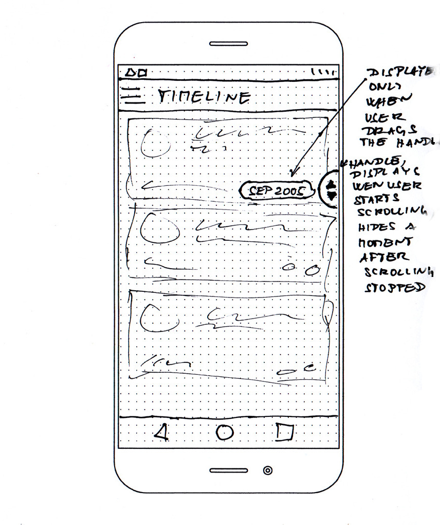
Timeline
The timeline is the most important screen in the application and the user will spend most of his time there. It’s also the hardest screen to design because there are so many options. I suppose that the task of designing this screen might occupy a whole UX team in some company for a long time.
Let’s summarize the requirements:
- It displays activities ordered by the time.
- Activities might be undergoing (happening right now) or in the past.
- Every activity has title and category (represented by a colourised icon), the time when it was started, and a duration.
- If an activity has a note or a mood (an emoticon) attached, the user should be also able to see them.
- The user can start add a new activity and display/edit an activity interactions from this screen.
- The user also needs an access to the menu.
- The user should be able to easily navigate a long period of time.
- We want to be able to track multiple activities in parallel.
The last one is an important requirement. It complicates our situation and limits our design options. Is this requirement really needed? And do we need an unlimited number of parallel activities or would it be valid to limit the amount somehow?
There are possible use cases for 2 parallel activities:
- travelling (driving/reading) and some other (in such situation meaningful) activity. E.g. commute on public transport and reading or listening to a podcast).
- Sport (e.g. running) and listening to a podcast or an audiobook
And what about 3 parallel activities? Honestly, I wasn’t able to come out with a possible use case. Therefore it seems we can limit the maximum number of parallel activities to 2.
So how should be the timeline presented? And how parallel activities should be presented? Those are some of the options I was considering:
Option 1: Literally display a horizontal timeline and visually attach activities to it using lines. One point on a timeline may lead to several boxes representing several parallel activities. It’s hard to imagine, how it actually should look. I attempted to sketch a few variants but nothing looked right.
Option 2: Show a calendar-like schedule, imagine Google calendar switched to the “day” view. That means that a particular amount of time is represented by a fixed space on the display. Activities that are parallel are displayed next to each other horizontally and occupy less width than activities that are not overlapping with any other. That would mean a lot of white space. There might be some clever way how to collapse free time and keep clarity.
Option 3: Use cards from material design and display them one after each other. There might be subheaders which would help the user to orient in time. Since we know, that it’s possible to limit the maximal amount of parallel activities to 2, we might be able to fit two cards next to each other in order to indicate their parallel run. I sketched the idea but I didn’t like how it looked when the activities were overlapping partially.
I spent some time thinking this one through and then I remembered: I am trying to find a simple MVP-like solution, which can be built with basic components. That’s why I chose the option 3 and decided to abandon the idea, that the timeline somehow reflect the fact that some activities overlap. So: activities will be represented by full-width cards. The activities, which are in progress, will be always at the beginning.
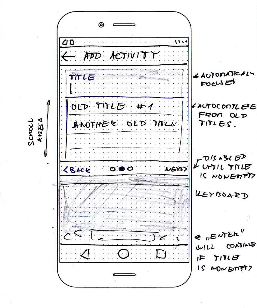
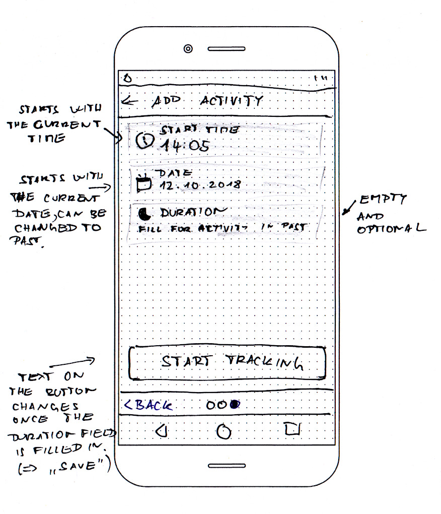
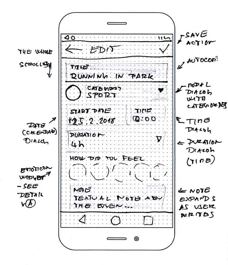
Add activity flow
I decided to use simple wizard-like flow with a horizontal stepper. The user can return back and change values for each step.
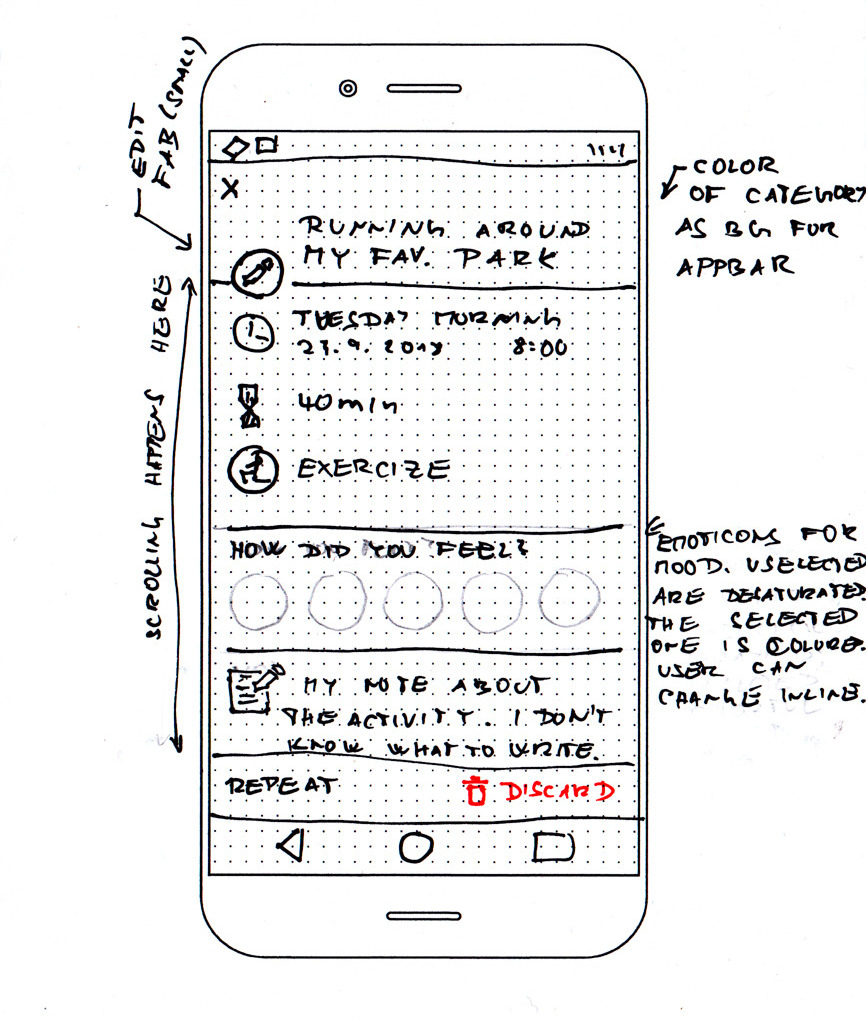
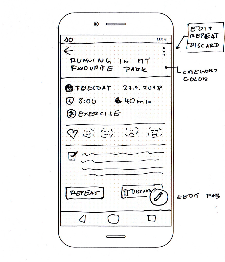
Activity detail and edit
The big question in this part was if the detail screen should also act as an edit screen. In the end, I decided to separate those two. There will be a detail screen with an edit action and a specialized edit screen. I sketched two slightly different variants of the detail screen and I am not fully decided which one I prefer (I might end up with another variant that combines those two) so I have included both of them.
Navigation
Navigation can be as simple as standard Navigation Drawer. I decided to join backup & sync to a single item. You may remember that they were separated in the navigation flow. This is one of those details which are easy to change
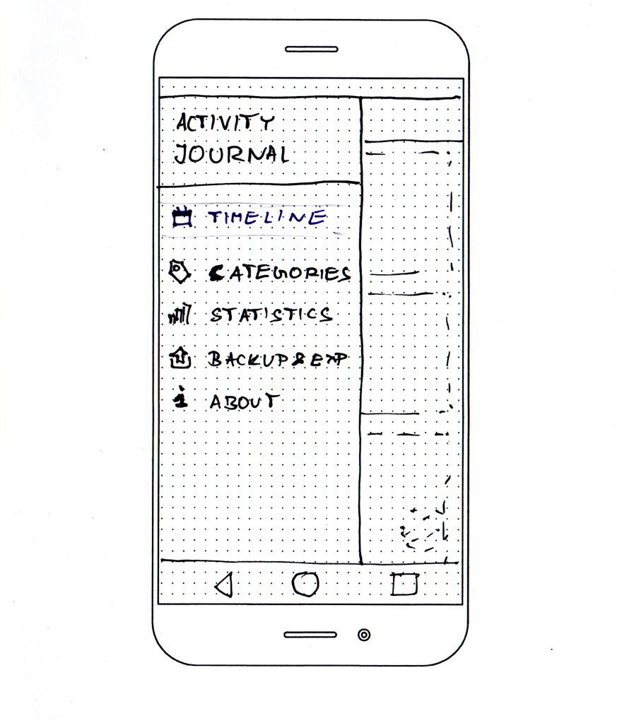
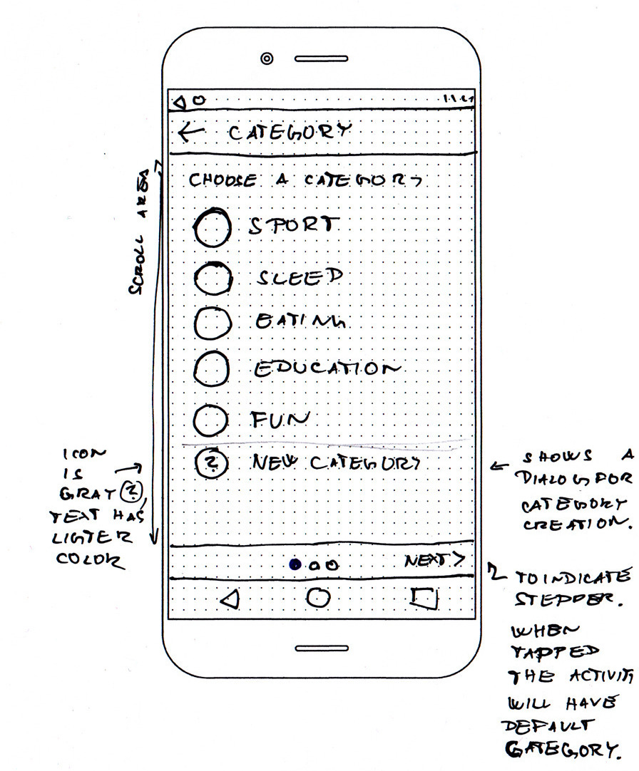
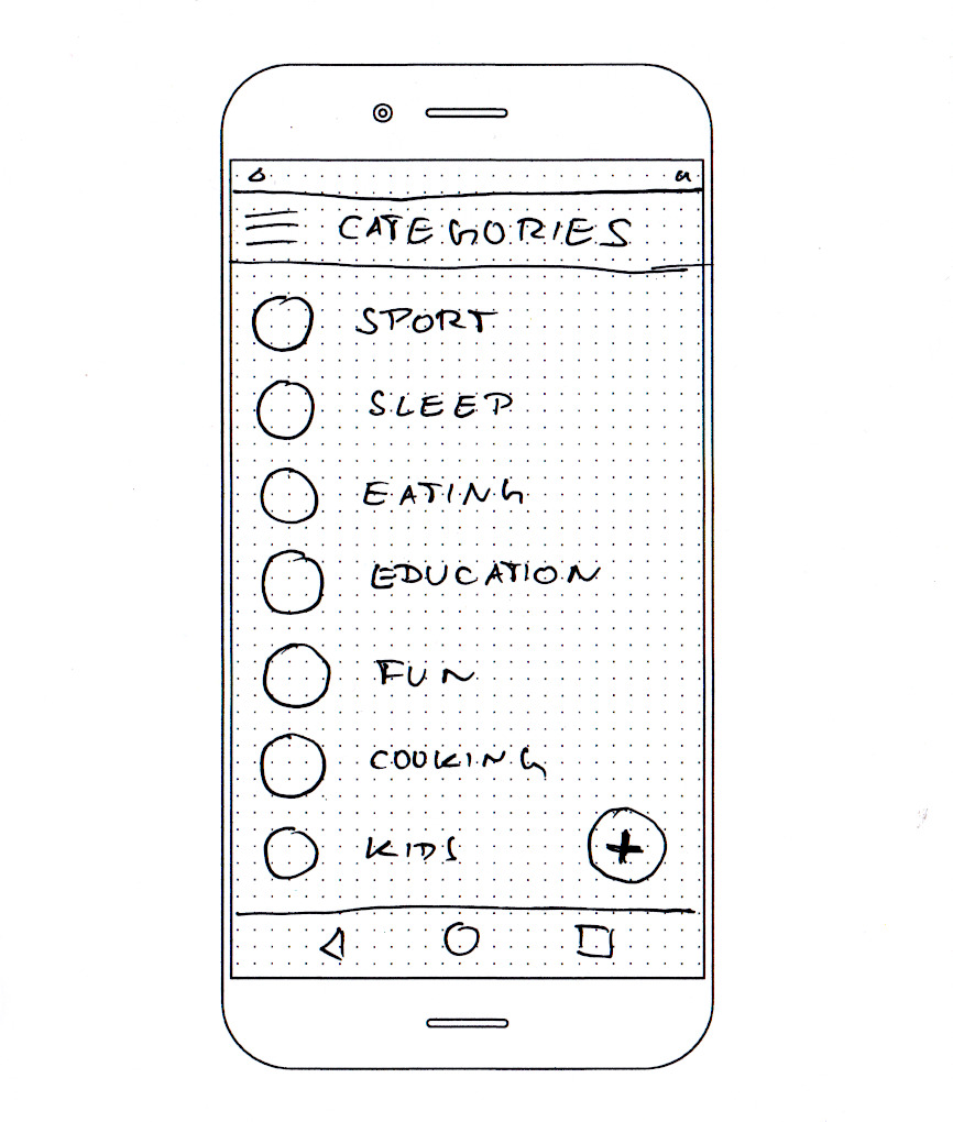
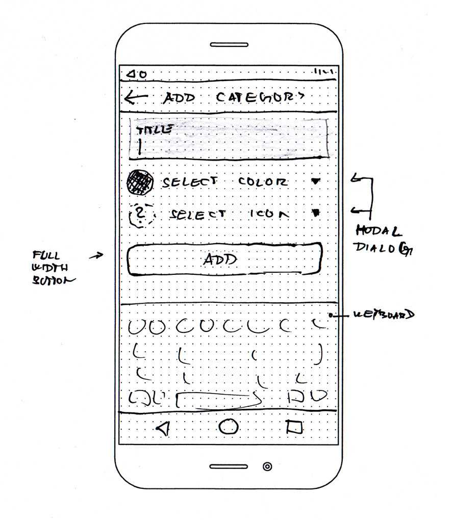
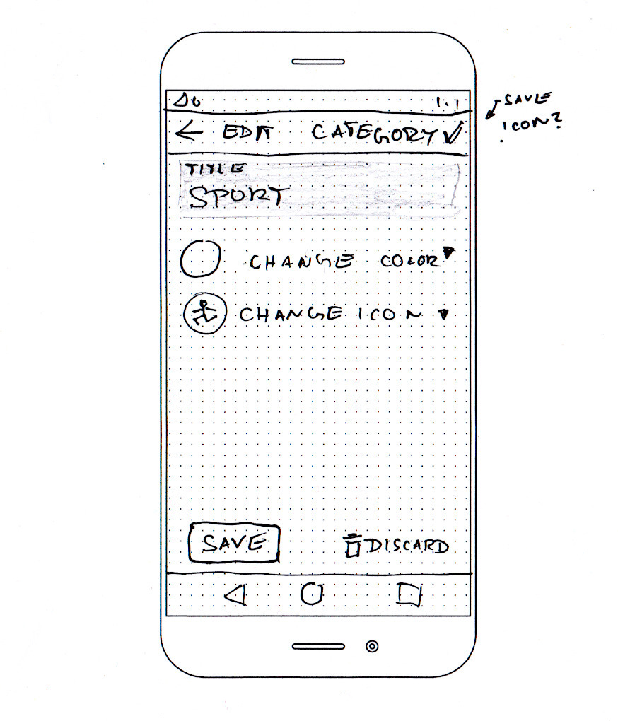
Categories
The user can manage (create, update, delete) categories. There is a simple list of categories accessible from the navigation drawer. Tap on a row displays screen with an editable detail for the category. The category edit screen is almost identical to the add category screen. The add category screen can be also accessed from the first screen of the add activity flow.
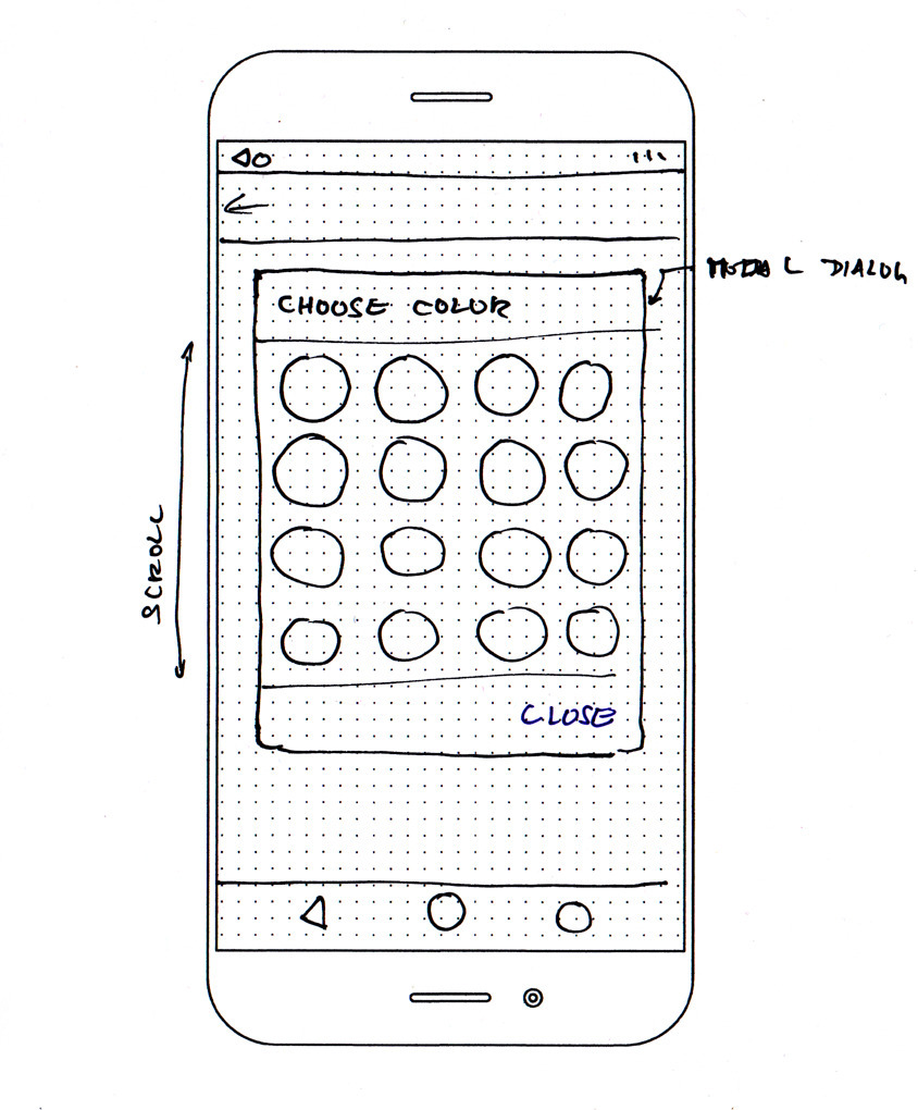
Selection of colour and icon is done through simple modal dialogues. There will be a fixed palette of colours and a fixed set of icons.
Remaining screens: Backup, Sync, About
I skipped those screens for the time being. I may draw some wireframes once I get to implementing them. But from my current perspective, those screens are marginal.
What’s next?
I am going to create a repository with a skeleton for the project and write the first test. In the next article, I want to cover used technologies, the project’s structure and some other starting stuff.
Footnotes
-
There are even iterative UX development methods out there. ↩
-
Minimum Viable Product. You all know them. ↩
-
I am not a skilled drawer at all. However, it’s still the most accessible method for me. There is a plenty of nice design tools out there, but I don’t have any nice wireframing tool of choice at the moment, and I don’t want to get lost in a “tool evaluation paralysis”. And also, it is fun to do, at least once you stop thinking about how terrible your drawing is. You should try it and you may also want to read this great article about paper wireframing. ↩
This article is Part 2 in a 3-Part Series.
- Part 1 -Activity journal - a mobile application idea and a personal project kickoff
- Part 2 -Activity journal - designing UX
- Part 3 -Activity journal - progress update